Last week, the British royal family unveiled the first official portrait of King Charles III since his coronation, and it proved to be divisive. The 75-year-old monarch was depicted in a red uniform against a red backdrop, and the ethereal style didn’t sit well with everyone. Comments about the uniform took over social media – especially in the U.K.
The new portrait was done by artist Jonathan Yeo, the king presented it publicly for the first time on Tuesday, March 14 at Buckingham Palace. According to a report by The Associated Press, Yeo was actually working on the portrait for over a year before the passing of Queen Elizabeth II. It was commissioned by The Drapers’ Company to celebrate the king’s membership in their organization for 50 years. The portrait is over eight feet tall and over six feet wide, and will be on display at the Philip Mould Gallery in London for the next month before moving to Drapers’ Hall.
Videos by PopCulture.com
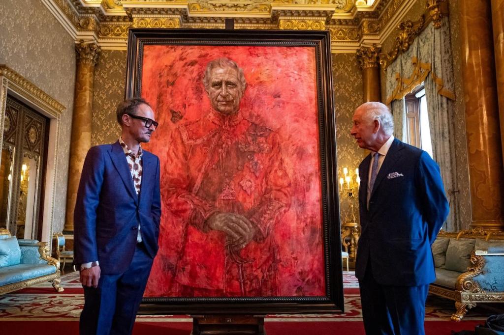
The king’s head and hands are depicted in muted but recognizable hues – he is shown standing in a Welsh military uniform with his hands clasped over his sword. Because the uniform, the sash and the backdrop are all in relatively close shades of red, they have a unique appearance. Yeo explained: “When I started this project, His Majesty The King was still His Royal Highness The Prince of Wales, and much like the butterfly I’ve painted hovering over his shoulder, this portrait has evolved as the subject’s role in our public life has transformed.”
Nothing in the royal world comes without controversy, and this painting is no exception. Here’s a look at what pundits and commentators have said about the portrait so far.
British Pundits
Generally speaking, British pundits on the news and on social media called this painting disrespectful, technically unimpressive and just plain “ugly.” Piers Morgan and his panel compared the painting to, among other things, a menstrual cycle, engaging in the public discussion but ultimately dismissing it fairly quickly.
Negative Reviews
Art critic Jonathan Jones wrote a one-star review of this portait for The Guardian, calling it a “formulaic bit of facile flattery.” Jones writes that he likes Yeo as a person and found him charming on his press tour surrounding this painting, but the work itself left him wanting. Jones noted that he did not care for Yeo’s previous work either, and he found the inclusion of “monarch butterflies” to be superficial and impersonal.
Another negative review written by Sebastian Smee for The Washington Post calls the portrait “frightening,” and an “assault” on the eyes. He wrote that there were “so many decisions avoided” in the creation of this painting, explaining: “”Do we want pretty or gritty? Abstract or figurative? Symbolism (note the butterfly, standing for Charles’s transformation from prince into king) or realism? Illusion of spatial depth or a flat, all-over effect? Dignified royal reserve or palpable collapse into pathos? It’s all there. A heap of oxymorons, a pileup of platitudes.”
Positive Reviews
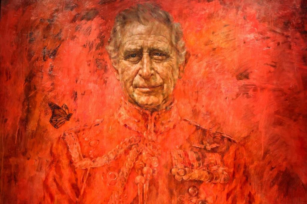
Simon Collins’ positive review of the portrait for The Nightly begins with the caveat: “I’m no fan of the royal family, in fact, i despise everything monarchies stand for. However, I love the first official portrait of King Charles.” Collins praises the painting’s “clobber” of color, which he feels “fades into crimson brushstrokes” as you look at it.
More importantly to Collins, he praised Yeo for embracing the controversial response to his painting. He felt that it was a positive change for an artist to make a bold statement with this kind of portrait now that monarchs do not possess the unilateral power to punish them with violence. He wrote that Yeo’s works “care little for their subject’s self-regard but connect to deeper truths.”
Conspiracy Theories
On social media, you’ll find plenty of posts from users who thought that this painting was meant to imply that the king is in hell, or is drenched in blood, or other existential connotations. These are valid as interpretations of art, but are not meaningful evidence to support any conspiracy theories.
Media References
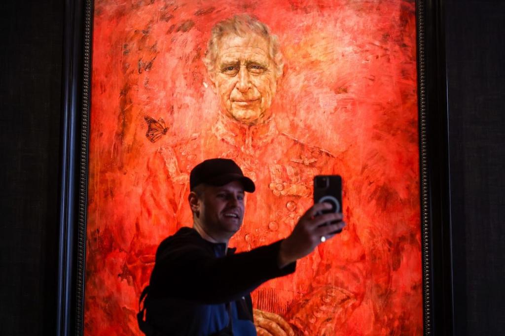
Others got to work comparing this painting to recognizable scenes from movies and TV shows – it reminded some of the bloody elevator scene from The Shining, and made others think of the villain from Ghostbusters 2, and so on.
Memes
Finally, the painting’s unveiling brought out some unique new memes as users pasted into scenes from video games, viral images and other self-referential works. They also meticulously copied fictional characters or other people into the portrait, or even themselves. The chatter died down quickly, but it’s clear that this painting made a big impression on some viewers.


